


[Editor's note: We here at the Scene are blessed to work with J.R. Lind, in part because we get to experience — daily — his lengthy Slack screeds expounding his theories on a wide variety of subjects. For example, why The Bellamy Brothers' "Let Your Love Flow" is a Christmas carol, how Dirty Dancing is an allegory about the history of the American left after World War II, and why orderly bison are to blame for our city's transit woes. Rather than keep this bricolage of verisimilitude to ourselves, we've asked him to share some of his declamations with our readers.]
Wednesday night, District 17 Councilmember Colby Sledge used a rather hokey metaphor to ultimately suggest that perhaps it's time to design a new Metro flag.
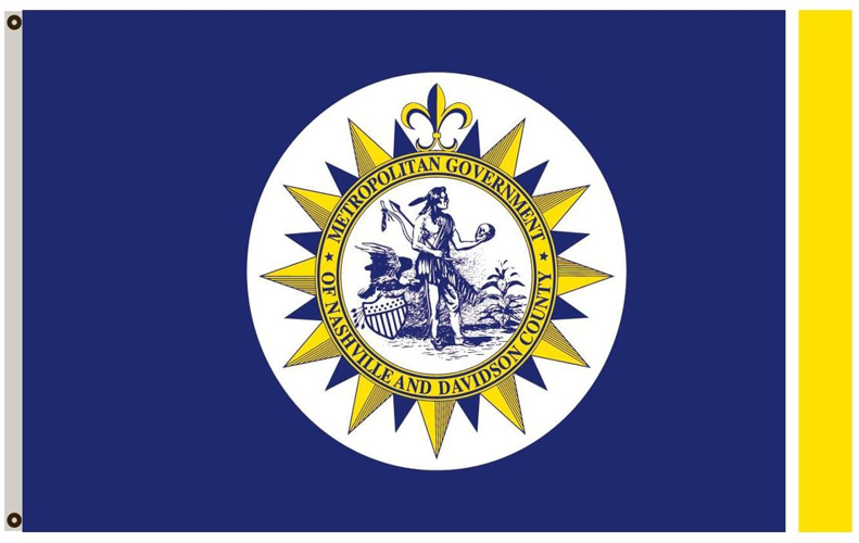
In use since 1964 after its adoption following the merger of city and county, the flag features our charmingly inscrutable seal on a white disk on a field of blue with stripes of gold and white on the fly end (or "azure, a plate charged with the seal of Metro Nashville, a pale or in fly cottised argent" if you are a nerd). According to the resolution of adoption, the blue stands for the courage and conviction of the city's leaders, and the gold symbolizes the richness of Nashville's land and resources. Um, OK! It was also allegedly based on Tennessee's flag, which, sure, in that they both have circles and colors, I guess.
Generally, I am not wild about flags that are just the seal or coat of arms of a locale stuck on solid color. It's hard to distinguish from a distance, for one thing (which, historically, is the whole point of a flag), and often leads to flags being busy. That's particularly true if the seal itself features a lot of elements — like, for example, a guy holding a skull, a tobacco plant, an eagle and so forth.
Vexillologists don't think much of Metro's flag either, having ranked it 43rd among 150 city flags. When this report came out, then-Mayor Bill Purcell told The Tennessean: "People in the rest of the country may not appreciate our unique flag. It's a flag that takes some time to get comfortable with. There are not many flags with a skull on it."
His last sentence is correct. Wikipedia (naturally) has a page of flags featuring skulls. For the most part, as one might expect, most of them are connected to piracy in one way or another. There's a bunch tied to various Nazi groups and other such malefactors. Only two other localities — the Spanish city of A Coruña and the Mexican state of Tlaxcala — have skulls. Nashville's flag is not on this page, surely one of Wikipedia's greatest oversights.

Nashville itself had another flag before Metroization. Aesthetically, it hits more of the requirements of good flag design, except for the Big N in the middle of it, which is even more lazy than just sticking a seal on something. It doesn't actually have a grand and glorious history, having only been adopted by the city in 1961. Given that it was just four years after school integration began and the year following the sit-ins, its Confederateishness feels a bit icky.
So our choices, historically, are the current ill-designed flag and an older icky flag. Maybe Sledge is right. Maybe we need a new one. Sure we've got lots of other things going on. There's this pandemic on, one of our most visible historic districts just got bombed, no one knows how out of balance the budget is, and the Predators still can't score on the power play.
But maybe a citywide art project would be good for the soul. Personally, I rather like the color scheme (the white stripe next to the gold on the fly could be considered a violation of the rule of tincture), and the blue-and-gold has been adopted in various ways by some of our local professional sports concerns, and is thus a symbol of the city irrespective of the flag itself.
Ideally, flags should be distinctive, easy to reproduce and represent all of a place (rather than just a small portion of it) and its people. Nashville's current flag certainly satisfies the first requirement, though it fails rather spectacularly in the second and third, given that we are all just guessing at what the seal means anyway.
Flags should also be of a timeless design aesthetic, or you end up with 1980s morning-show flags like Pueblo, Colo., or Whittier, Calif. Don't let a desire for inclusion lead you to including everything, à la Tampa. And for the love of goodness, don't let the Convention & Visitors Corp or the Chamber of Commerce anywhere near it, or you end up with what you deserve (looking at you West Hollywood).
Good city flags are possible! Just ask (deep breath) St. Louis, Norman, Okla., Portland, Ore., Wheeling, W. Va., Chicago, Indianapolis, Bath, Maine, Anaheim, Calif., Washington, D.C., or Santa Barbara.
Get to drawing, if you are so inclined. If not, get to contacting your councilmember. They definitely want to add this to their plates.