

Last year,
Bill Rankin made a map of Chicago, showing the racial make-up of the city. If you've been to Chicago, you probably already know this, but it's still something to see how sharp the segregation by neighborhood is.
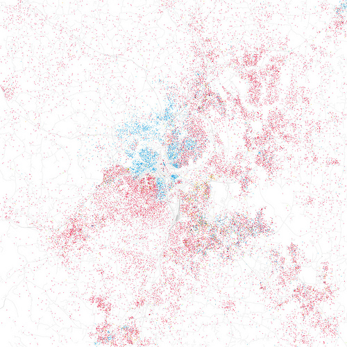
Eric Fischer decided to expand the idea to other cities. It's cool to see how people actually live in cities. The Nashville map is especially interesting. In old neighborhoods, we're kind of clumped together by race, but the divisions aren't very clear-cut.
"To match his map," Fischer writes, "Red is White, Blue is Black, Green is Asian, Orange is Hispanic, Gray is Other, and each dot is 25 people. Data from Census 2000." Look at us on the southeast side!