
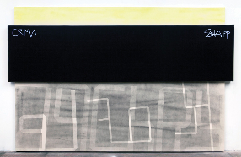


"79 Chrystie," Wendy White
, I wrote about Wendy White, one of 10 artists with work currently on view at the inaugural Sherrick and Paul Gallery exhibit. There was more in our interview than I could fit into the story, so I'm including a transcript of that conversation below. See White's work — and the rest of the exhibition — at
Sherrick and Paulthrough Jan. 10.
Country Life: You studied fiber in art school, right? Was there a specific reason that you made the switch from fiber art to painting?
I made the switch really soon after undergrad, and by the time I went to grad school eight years later it was for painting. For me, it was a very organic switch from doing textile design to stretching canvas. It's still materials — it's canvas and it's paint. The material sensibility I think is very much the same, it's just a different presentation.
But the thing that took forever was for me to let textile influences back into my painting. And now I think there's a huge influence of both the materiality of fibers and the tactility of fibers and also screen-printing in my layering, which is what I was trained in.
Do you think of your canvases as a kind of textile? What other elements are textiley in the work?
This is unprimed canvas, raw canvas. I use a lot of stenciling — blocking out certain areas and then lifting the stencil away. And stenciling is really ubiquitous in textile design, through many different forms. There's something in the way they're constructed that's very influenced by pattern design.
A lot of your work includes text, but only in reference. Do you consider words to be a successful vehicle in painting, or does your omission of full words and phrases mean you're diminishing them?
I can't remember when text became a really prominent part (of my art). For a while it was just sort of this hidden element — there would be little compartments in my paintings that were mostly abstract, that had bits of text, usually backwards, obscured somehow. And it had come out of the brushstrokes and the architecture of the way that I was building compositions that just naturally started to form into something legible. And then, at some point, I just figured that if I'm really going to do text, I should really do it. I should let it be a prominent aspect of the work. But that took a while.
Were you interested in text for the aesthetic value or for the meaning?
Originally it was an architectural interest. I was interested in how you could build a painting out of marks that weren't just arbitrary marks. I wanted something to anchor it. It felt like text was this real thing. A word has presence, it has meaning.
Tell me about the two pieces you're showing here.
Both of these pieces are from a series I started around 2010-2012 and it was all based on signage in Chinatown. So there's a lot of overlapping signs, signs that are placed on top of other signs, some of them in Mandarin or Cantonese, which then dissolve into graphics, and that intersection between legibility and illegibility, symbols and how that all fuses in NY — or doesn't fuse. It's kind of a big mess that turns into something else.
Why do you build these irregular edges onto the canvases?
The text was creeping out of the canvas, and I wanted to start cutting into the space in the wall. Rather than being a painting of text, I wanted the whole thing to have the quality of an object, so it wasn't just a painting on a wall.

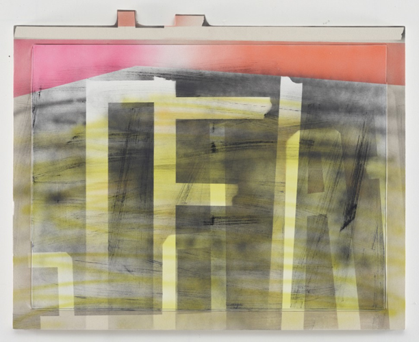
"Burger FF," Wendy White
Let's talk about “79 Chrystie.”
This piece was from the Fotobild series. It's a sign that wraps around the painting, it's the exact same materials as a deli sign. On the back you can see that it's all roped onto a steel frame. It was made at a Chinatown sign company — the same people who make the signs that are on all the shops. It has two illegible tags that are my memories of the tags on a specific building on Chrystie Street that I looked at every day on my way to the studio. This is the beginning of me using digital elements in my work. This is a Photoshop constructed — ink-jet printed on vinyl.
It's not the materials of painting. That was the departure point for incorporating photo. It doesn't give you a photo vibe, but there's something about the surface, the glossiness of it. This particular piece was a jumping-off point for almost all the work that I've made since. The next show that I did was work based on this particular painting.
Can you talk a little about your decision to replicate the graffiti instead of asking the artist to tag the work directly?
I think my interest in graffiti, I'm really interested in how it interacts with the city. So not so much for a political investment in it as a derelict act, I've never been a street artist, I don't come from that background. But I love the way that a freehand mark interacts with the architecture. It's a real invasion, and it's so pure. To write your name on something in the city is a really powerful, profound thing to try to do. Because you're a blip in 13 million people, so to write your name on a brick is just saying I WAS HERE.
So it's more inspiration than appropriation.
Right. The photo-based work I do now incorporates the figure, and that was actually inspired by the reflection that you can see in this piece. There's something about it, I didn't really think about it until it was hanging in the gallery a couple years ago, that suddenly the figure was in there, but I hadn't put it in there. And I thought there was something about that that I wanted to continue somehow.
What kind of paint did you use here?
Airbrush paint and textile paint, so it's actually a paint that bonds with both vinyl and a raw surface.
And you've installed it really close to the floor. What went into that decision?
It changes the way you approach the painting, You're not approaching it as a window, like in an art historical way. You're approaching you as you would a barn door. It's more object.
Have you planned out the solo show that's slated for April?
Yes — I plan to show really large-scale paintings that are a combination of photographic figurative image and handmade rugs.
So you're back to textiles!
Yes! It's interesting that this building was a hosiery mill. Each one has a custom handmade hand-painted carpet, so they're almost like spills. And there are some small paintings that are in gold mirrored frames.
One last question, for my archives: What do you think makes a good art scene?
In any city, there has to be a good museum with connections to local galleries. I think museum trickle-down is really important. A good institution that gives a crap about what people are doing and is connected. A lot of times in smaller cities there's this huge disconnect — there are things going on in museums that nobody cares about. An art school is really important, because students just make everything better. … Nashville is a great place with so much entrepreneurship happening, and so much taste. Just really, really damn good taste, everywhere you look. And that's exciting.