


Ann Catherine Carter
When Ann Catherine Carter's Nothing Never Happens opened at 40AU in May, it was one of the more eye-catching exhibitions of that month's First Saturday Art Crawl.
I wrote a post about ithere in Country Life. Here's a recap:
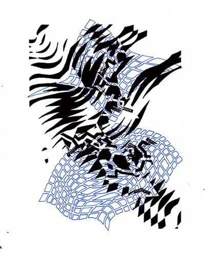
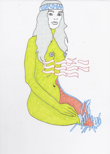
Ann Catherine Carter's Nothing Never Happens exhibit at 40AU is yet another show of big, bold abstractions in a local spring season that's been packed with similar work. It's not a bad thing to be a part of a trend, and I make the point simply because timely comparisons always inspire a desire to rank one artist against another, and Carter is holding her own here. Carter's show consists of mostly large canvases layered with enamel, acrylic, spray paint, aluminum and screenprinting. Carter is similarly democratic about her images — they veer from the expressionistic star chart of “Wipe Memory” to the graphic zigzags, stripes and numeral 3s in the similarly named “Head in the Clouds” and “Distraction.”The whole show has a mathematical feeling to it, and Carter is attempting to access that space where the real, actual world and its virtual, digital representation overlap. She manages to evoke the spirit of the digital environment with her numbers, repeating stripes, glitchy zigzags, and boldly colored geometric elements, and the aesthetic here even feels a bit like a reboot of the same look that accompanied humanity's first virtual voyages during the emergence of cyberpunk culture in the late 1980s and early 1990s ...
Nothing also included a book of Carter's drawing-a-day project, creating an interactive element in a show that was at least partly preoccupied with virtual realities. The handsome volume was a surprising highlight to an already strong show, and Carter's decision to publish the book as a stand-alone edition is yet another reason to pay attention to this artist/curator's prolific projects.
I sat down with Carter's new book and came away with several questions that I sent her via email. Here's that correspondence accompanied by some of images from Carter's project...

In the short intro to your book, you explain that your drawingaday project aimed “to explore digital processes and the causality and sincerity of an image.” Tell me more — the causality between what factors and effects?
I was interested in the duality between a physical drawing created with traditional mark-making tools like as ink versus a virtual drawing created with digital tools and computer applications. I wanted to challenge my own hesitations with digital processes and its ability to make a mark that felt genuine.
This was also a way for me to create visual evidence from physiological reflection on memories, moments and subjective thinking — I drew from my emotional pool and brought forward something unseen. In these moments, I couldn’t fully comprehend what it was that was conjuring up the imagery, and it was only later that I could attempt to analyze and make sense of it all.
What do you mean by "sincerity"? How does the idea of sincerity change between analog and digital contexts?
Sincerity is a characteristic of being free from pretense or deception. This is something that I strive for in the process of making each image. I wanted to try to express a poetic gesture everyday, and give intuition validation as a form of knowledge; it forced me to be vulnerable with myself, to attempt to make something as honest as I could in that given moment. As intuition as the guide, it allowed something to happen without composed structure; i.e. it allowed for causality to produce the effects of the image. That being said, these moments were similar to, well, writing a letter to a friend without constructing a first draft. You may have played through the sentences repeatedly in your mind, but it’s never the same when it manifests on paper.
The idea of sincerity changed between the “analog” and the “digital” because the digital relates so heavily with modern forms of marketing and advertising, i.e. visual maneuvers I would say are deceptive. Using this format with this sort of conscious knowledge helped me find the aesthetic qualities that I was attracted to in the digital — like flatness, all-over color, smooth or bitmapped forms — as well as its cold and detached demeanor. I wanted to find how this process could stand alongside the physical, as well as discover the similarities and differences between them.
Your drawingaday project lasted from Dec. 31, 2013, through March 1, 2014 — roughly two months. But the book only includes about 40 images. How did you choose what to print and what to leave out?
It wasn't important to me to show a linear narrative of the “progress” I was making with the project. I needed to edit down and find the strongest compositions, as well as continue to edit some of the physical drawings digitally and create some sort of formal play between them. In addition, I wanted to bridge some of the characteristics of the Internet, where one disjointed thing seems to slip into another in a nonlinear format.

You had an early printing of the book at your Nothing Never Happens show at 40 AU in May. The book was a creative addition to the exhibition, so why did you decide to self-publish and print this edition? Why did you want to make a stand-alone book available?
It is important to me for people to be able to have a physical copy of the work. A book is a way for people to view it in an intimate way, perhaps sitting in bed alone, similar to the letter writing I explained earlier. There is also an issue of presence, where in a gallery setting you can view the book in a particular way, but it is detached from daily life. By printing the book, it allowed for intimacy to exist.
Let me not forget to state that this also allowed the tension between the analog and the digital to be on the forefront, where I was responding to the physical qualities of the book and of the printed images that composed it.
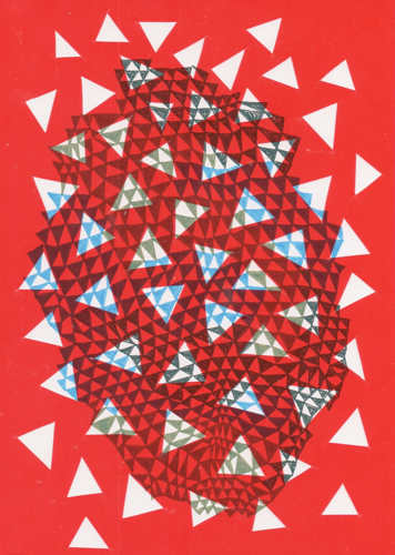
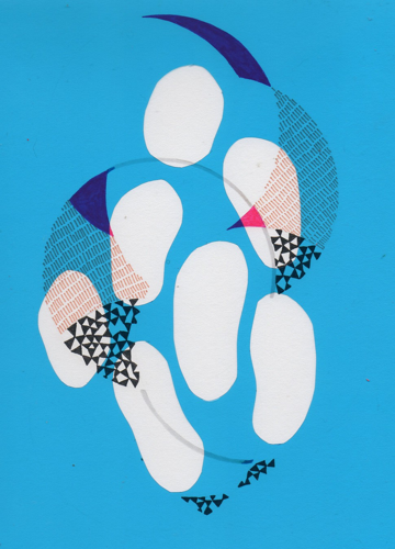
There's a lot of variety between these covers — figures, abstraction, text. As you created these from day-to-day, did any trends develop or did you simply start fresh with each new drawing?
In viewing all the images together in succession, I recognized trends like forms and shapes, as well as concepts and interests that grew off each other. I even identified more ambitious moves later in the project where I began to bridge the analog with the digital. The book became a final mixture of that in more ways than one.
In my practice, there is a drive to create something that hopes to embody an egalitarian way of making. For me, each work is personified as a member of a community. That’s why the processes and images — and even with my show at 40AU — seemed disjointed through my use of a diverse range of figurations, abstractions and text. The multiple ways an image can be expressed embody my values and desires for an egalitarian society, a multiplicity of individuals, and diversity across the board.

Many readers might think of drawing as a paper-and-pencil exercise. How are you using the word "drawing" here?
“Draw” can mean a number of things, one of which is obvious in relation to the project, which is to produce an image with lines and marks on paper. Or the term can be used in another context where “to draw” is to pull or move something in a specified direction. I also think the phrase “to draw away from” defines abstraction, an indicator of my visual interests.
The motives that drove each drawing were based on intuition structured through something habitual, something of the everyday, which helps explain why drawingaday was titled as such. The term “workaday” came to mind — a term used to describe “the relation between one’s work or job” or even “ordinary.” In essence, workaday embodies the everyday. With that sort of habitual structure, I wanted to integrate play as part of a daily routine, allowing intuition to be the governing “workaday” process.
What software did you use to create these? There is a real retro, home-computer look to these images. Was that a conscious choice? Why did those aesthetics speak to you?
For the digital processes, I used Adobe Illustrator and Photoshop interchangeably. I think the 80s aesthetic may have come into your mind is because of the graphic nature of the images, the solid colors, the layouts and the disruption of a grid. Peter Halley and Jonathan Lasker, two painters who are influential on my practice, made a lot of work during the ’80s, both commenting on digital processes and the physicality of a graphic image.
Check out the online version of Carter's book and purchase your own copy — it's way better on paper — here.