
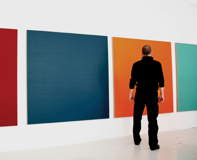
When art critic James Elkins spoke at Lipscomb in 2006 about visual culture in the university, he made the comment that visual arts education doesn't put a premium on precise visual information. Art history training relies on slides, reproductions and PowerPoint projections, where much of the detail is not visible—this in contrast to the sciences, where visual precision in the presentation of data can be critical. With a painter like Lars Strandh, a Swede living in Norway, you run into the repercussions of this phenomenon. In reproduction, his paintings look like monochrome rectangles straight out of Ellsworth Kelly. But nothing could be further from the experience of seeing them in person at Zeitgeist, where you find subtle textures and luminous surfaces that no print can reproduce.
Zeitgeist currently is showing a series of paintings by Strandh, all of which follow a similar model. Each rectangular work consists of a single color tonality built up from horizontal lines of related tints painstakingly painted by hand. The technique produces complex visual effects and leads into a surprising interplay of disparate sensations.
The first impression of Strandh's paintings comes from their rich color. Each panel focuses on a single range of hues: aqua blue, red, orange and white to name a few. Every painting contains roughly five or more different tones. He chooses them carefully so no single line stands out. Each of these paintings may contain 15 layers of paint, and Strandh works to make sure he gets exactly the right balance of tones. Creating a single color out of several related shades produces a sensation of lushness that you would not necessarily get from a truly monochromatic painting.
Several color effects occur in the paintings. First of all, the various colors converge toward a single tone as they blend in the eye. This is most obvious in a painting that appears to be black, but is composed of purple, green, olive and midnight-blue lines. It's like Eugène Delacroix's shadows, always composed with a mix of colors, never black. The blending of colors is more pronounced in the bigger paintings—the larger amount of color covering the larger surface enhances the effect. So does the scale, since you tend to stand farther away from a big piece in a gallery, which makes it more likely that your eye will take in the object as a unitary whole rather than focus on its details.
Strandh also gets interesting results from the adjacency of various colors. Several pieces appear to get darker in their corners. These are the kinds of visual phenomena that color theorists like Josef Albers explored. The Frist Center's exhibit of prints by Chuck Close, who studied with Albers, showed someone working with those ideas in a scientific way, in silkscreens that overlaid a hundred colors or more. Strandh's method seems more causal and experimental, in spite of the clearly meticulous effort involved.
The variety of paint tones also gives these works a sense of texture. While your eye may blend the colors, you can also see the lines as striations that might be on the verge of unraveling. Where the impression of big monochromatic fields conveys sensations of solidity and impenetrability, when you focus on the lines the image seems less stable and more permeable. Also, the different paints used in each work reflect light differently, so depending on the viewer's position in the gallery, one set of lines or another will shine a bit and stand out from the background. This is another case where the apparent certainties and simplicity of these paintings give way to lots of nuance. Works that appear unquestionably flat take on subtle three-dimensionality.
The lines in these paintings have been painted freehand, without benefit of masking tape or guidelines. Though no doubt an impressive piece of draftsmanship, on closer look you see that the lines aren't really straight. In fact, few of the lines go all the way across the painting. What you see is more like a dense pile of dashes, almost as if Strandh compressed the bars from the chromatography used to test DNA.
The underlying dynamic of Strandh's paintings is their ability to represent both unity and disintegration. With his carefully modulated range of tonality, he makes sure that no single element or gesture has a jarring effect or brings attention to itself. But with a slight shift in the viewer's focus, each painting appears to contain a large number of discrete signals that don't quite emerge as a discernible pattern. They point to a fluid physical state—far from what you would expect at first glance. If you only see Strandh's paintings in reproduction, you'll never pick up on the degree of mutability and nuance you can find in this work when viewed in person.
Email arts@nashvillescene.com.