
With the announcement that U.S. Rep. Diane Black has officially entered the Tennessee gubernatorial race we now have six candidates — five Republicans and one Democrat — vying to succeed Gov. Bill Haslam. That also means we have six campaign logos.
The primaries are a year away, so there will be plenty of time for analysis of what is sure to be a soul-crushing contest. For now, let's break down the art. Here are the six logos, ranked.
6. Bill Lee
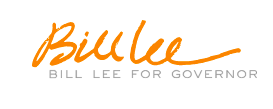
Sorry, Vols fans, this orange is gross (Editor's note: No, YOU'RE GROSS, Auburn grad). As Alex Lewis points out on Twitter, Lee deserves credit for getting his name in the logo twice and I suppose there's something to this that communicates a down-to-earth businessman's approach to campaigning. No logo, just my signature. My word is my bond. But still, no.
5. Diane Black
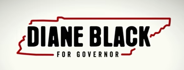
This type is ominous, like it's been branded across the state and can never be erased which, actually, is appropriate enough. But still, it's a little odd for a campaign. There's also the fact that, as Caroline Cranford notes, this (admittedly obvious) idea is already being used by another Tennessee candidate this year:
%{[ data-embed-type="oembed" data-embed-id="https://twitter.com/NorthCaroline16/status/892749142166056960" data-embed-element="aside">
4. Karl Dean
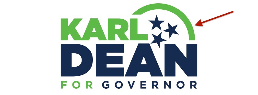
Dean is returning to the color scheme he used when he was running for mayor. It's fine. Green and blue have kind of progressive-ish connotations, which is a pretty good way to describe Nashville's former mayor. He uses the tri-star logo and the alignment seems at least pretty close to correct. As noted above, there is also the green arch which I assume symbolizes the Gulch pedestrian bridge. It is green in honor of the $18 million it will cost to construct the 700-foot long floating sidewalk.
3. Beth Harwell
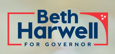
There's nothing really wrong with this logo. It makes nice, subtle use of the tri-star logo. It isn't as intense and scary as Black's logo, but then again that might end up being Harwell's problem in the Republican primary.
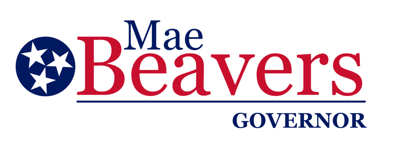
2. Mae Beavers

Mae Beavers is not going to be the governor of Tennessee. This is a good thing. But, hey, we're willing to give credit where credit is due here at Pith. This is a clean, sharp logo. Nothing too exciting or particularly creative, but that's not really what a campaign logo is about. Mae blocks us on Twitter, but some please pass along our compliments to her graphic designer.
1. Randy Boyd
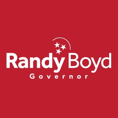
This is strong and straight to the point. Randy Boyd. Red. Governor. Tells you everything you need to know. Resident tri-star logo expert Blake Farmer, of WPLN, noted after Boyd's announcement that the stars here are slightly off. (You can watch him nerd out about the proper alignment of the logo here.) That's too bad. But still, this is the best there is right now. This is the one to beat, Craig Fitzhugh.
Update: Aug. 7
Fitzhugh is a go. Here's what he's bringing to the contest:
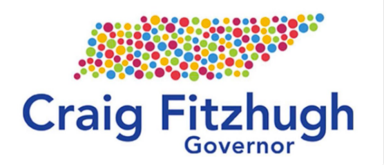
What do you think? Is there some sort of message in those dots that will appear if we cross our eyes our wear a special pair of glasses? One thing you have to give to this design: It will stand out. You'll remember this one if you start seeing it in front yards. For now, let's drop it into third place.
We reserve the right, however, to reshuffle these rankings once we start to see these logos on buttons, t-shirts, fidget spinners, etc.